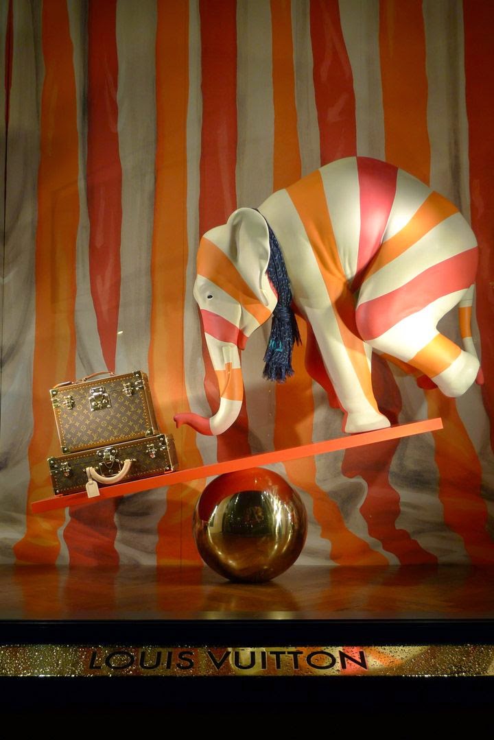
LOUIS VUITTON Paris. 2012
When walking the high-street no matter of the country you can easily tell which retailer takes his business seriously enough just by looking at his shop window.
Let's start with a simple question "Why do we shop?"
And usually there are 3 main reasons, not considering the gender differences and etc.,
A need for a solution, result or relief from something
Therefore when marketing your product at your prime spot, a shop-window, it is crucial to address one of the above.
But if it's so simple, why do we see some displays that literally destroy the products and the brand and some that are real attraction points that bring lots of money for the company?
Once again it is simple.
A visual merchandiser needs to always look at the product's benefit behind the benefit.
Let's see the practical side of all this.
Louis Vuitton Dublin. The display clearly talks about the benefit of fitting many shirts in a suitcase, as well as the eye catching white shirts are seen from afar.
Now here, it's a display disaster. Trying to appeal to women with exposure of a beautiful lace, the product is concealed by a VM's proud moment to make lace balloons.
I will leave these two, a food for your thought...
Stepstyles in Stockholm A/W 2012/13
For Hermes by ZimZou


No comments:
Post a Comment